Lawmakers often reshape voting districts to shift the balance of political power. That’s unfair to voters, even those of us with questionable judgment.
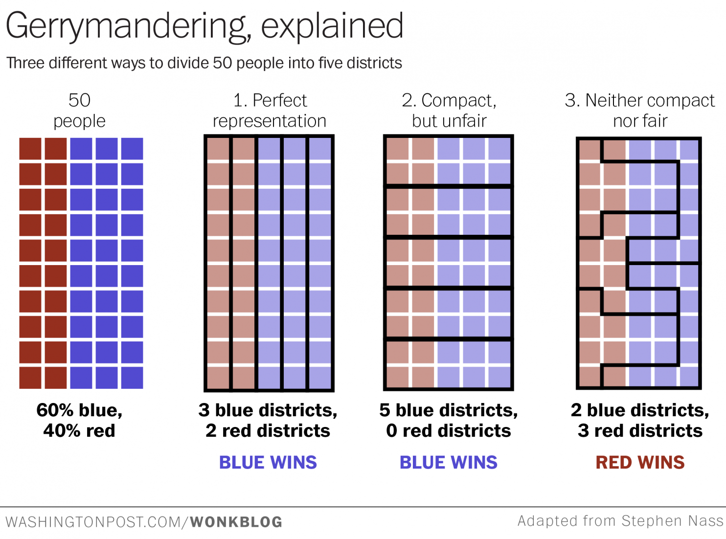
Gerrymandering — drawing political boundaries to give your party a numeric advantage over an opposing party — is a difficult process to explain. If you find the notion confusing, check out the chart above — adapted from one posted to Reddit this weekend — and wonder no more.
You may be interested
Suppose we have a very tiny state of fifty people. Thirty of them belong to the Blue Party, and 20 belong to the Red Party. And just our luck, they all live in a nice even grid with the Blues on one side of the state and the Reds on the other.
Now, let’s say we need to divide this state into five districts. Each district will send one representative to the House to represent the people. Ideally, we want the representation to be proportional: if 60 percent of our residents are Blue and 40 percent are Red, those five seats should be divvied up the same way.
Fortunately, because our citizens live in a neatly ordered grid, it’s easy to draw five lengthy districts — two for the Reds , and three for the Blues. Voila! Perfectly proportional representation, just as the Founders intended. That’s grid 1 above, “perfect representation.”
Now, let’s say instead that the Blue Party controls the state government, and they get to decide how the lines are drawn. Rather than draw districts vertically they draw them horizontally, so that in each district there are six Blues and four Reds. You can see that in grid 2 above, “compact but unfair.”
With a comfortable Blue majority in this state, each district elects a blue candidate to the House. The Blues win 5 seats and the Reds don’t get a single one. Oh well! All’s fair in love and politics.
Click here to view the best explanation of gerrymandering you will ever see.


